Responsive Web Design
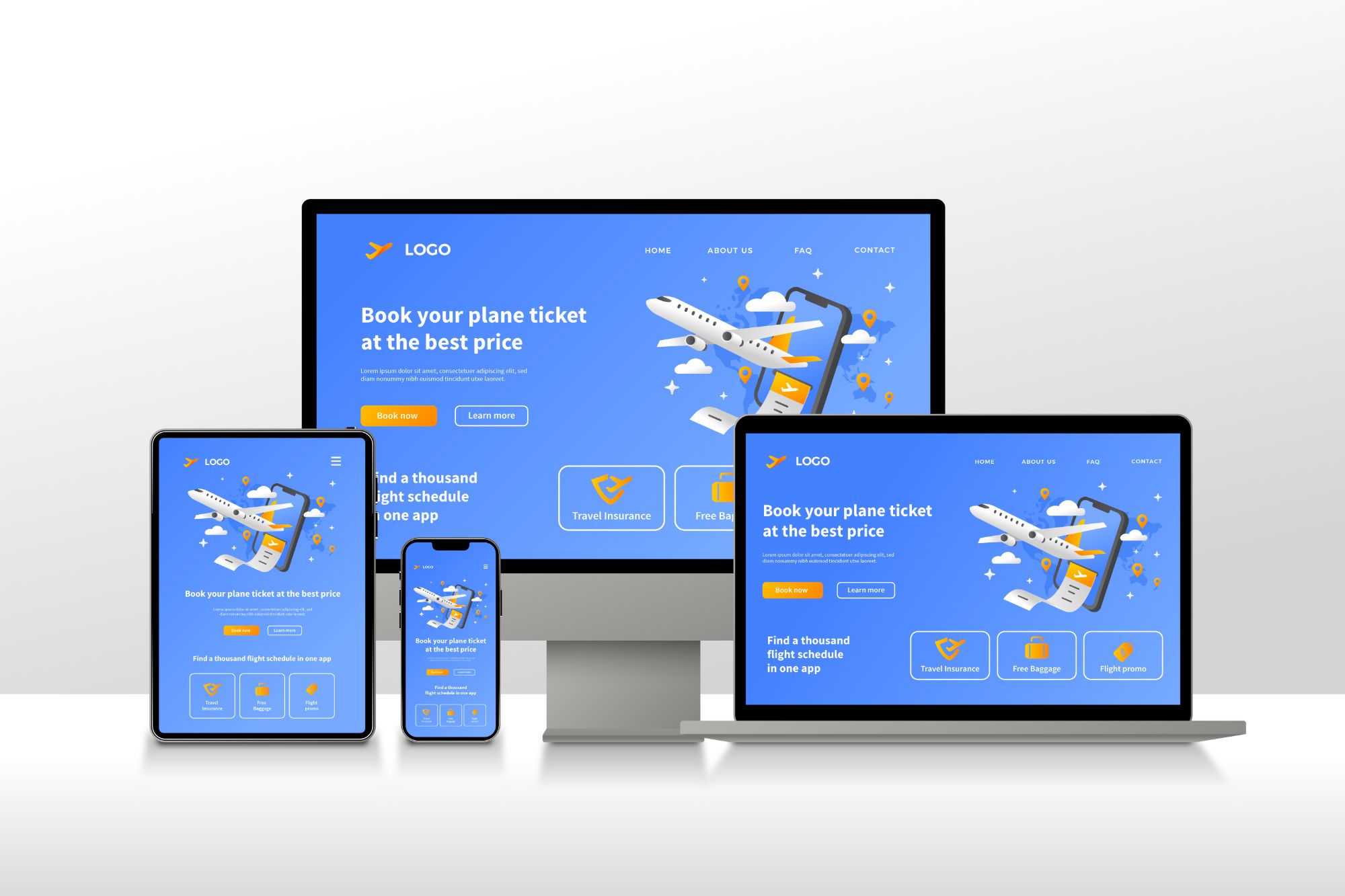
Perfect on Every Device
Mobile-first websites for 80%+ Sri Lankan mobile users. Your site will look stunning and work flawlessly on phones, tablets, and desktops.
Is Your Website Losing 80% of Customers?
The Reality in Sri Lanka:

One Website, All Devices
Responsive design means your website automatically adjusts its layout, images, and functionality to provide the perfect experience on any device.
Mobile Phones
320px - 480px
Optimized for 80%+ of your visitors. Touch-friendly buttons, readable text, fast loading.
Tablets
768px - 1024px
Perfect layout for tablets in portrait and landscape. Maximizes screen real estate.
Desktops
1200px+
Full-featured experience for desktop users. Beautiful large-screen layouts.
What You Get with Responsive Design
The Impact of Responsive Design
Clients see 250% more mobile visitors after responsive redesign
Mobile users stay longer when site works properly on their device
More mobile inquiries and sales with responsive design
Our Mobile-First Design Process
Mobile Design First
We design for mobile screens first, ensuring perfect experience for 80%+ users
Scale to Tablets
Expand design to tablet sizes, optimizing for both portrait and landscape
Desktop Enhancement
Add desktop features and layouts, utilizing larger screen real estate
Cross-Device Testing
Test on 20+ real devices to ensure perfect experience everywhere
Responsive Design FAQ
What is responsive web design and why is it important in Sri Lanka?
Responsive web design means your website automatically adapts to any screen size - phones, tablets, or desktops. It's critical in Sri Lanka because 80%+ of internet users browse on mobile devices. If your website doesn't work well on mobile, you're losing 80% of potential customers. Google also ranks mobile-friendly sites higher in search results.
How much does responsive web design cost in Sri Lanka?
All our websites include responsive design as standard, starting from LKR 60,000. There's no extra charge for mobile responsiveness - it's essential, not optional. This includes testing on all major devices: smartphones (iPhone, Android), tablets (iPad, Samsung), and desktop screens of all sizes.
What's the difference between mobile-friendly and mobile-first design?
Mobile-friendly means a desktop site that adjusts to mobile. Mobile-first means we design for mobile screens FIRST, then scale up to larger screens. This approach is better because it prioritizes the 80%+ mobile users in Sri Lanka, ensuring the best experience where it matters most. All our designs are mobile-first.
Will my existing website work on mobile devices?
Many older websites (pre-2015) aren't responsive and look broken on mobile. We can check your site for free. If it's not mobile-responsive, we can either rebuild it with modern responsive design or retrofit your existing site. Most clients choose to rebuild for better performance and modern features.
How do you test responsive design across different devices?
We test every website on: iPhone (multiple sizes), Android phones (Samsung, Huawei), iPads, Android tablets, laptops (13-17 inch), and desktop monitors (24-32 inch). We also test on different browsers (Chrome, Safari, Firefox) and orientations (portrait/landscape). You receive a fully tested, verified responsive website.
Get a Responsive Website Today
Don't lose 80% of your potential customers. Get a mobile-first responsive website from LKR 60,000. Free mobile compatibility check available!